
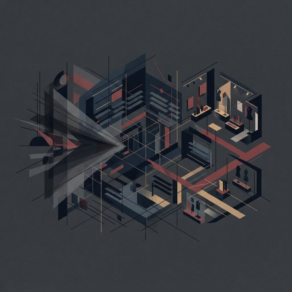
The Silent Architecture of Spending: How Retail Store Design Engineers Consumer Behavior
Empirical research reveals that the physical layout of a retail store — from the direction of its aisles to the color of its walls — functions as a sophisticated behavioral system designed to shape what you buy, how long you stay, and how satisfied you feel when you leave.
The Silent Architecture of Spending
When you walk into a grocery store, a clothing retailer, or a big-box electronics chain, you are entering a carefully engineered environment. The width of the aisles, the placement of the entrance mat, the color palette on the walls — none of these are accidental. They are the product of a sophisticated discipline that sits at the intersection of architecture, environmental psychology, and behavioral economics. And the evidence behind these choices is more robust than most shoppers ever realize.
Retail design, at its core, is the science of converting physical space into commercial performance. Empirical research confirms a significant relationship between structural store design, aisle configuration, and actual consumer buying behavior. The question worth investigating is not whether store layout affects what you buy — the data is clear that it does — but how these mechanisms work, and what the evidence looks like when examined closely.
The Decompression Zone: Your First Steps Are Already Accounted For
The moment a customer crosses the threshold of a retail store, they enter what designers and researchers call the decompression zone. This is the transitional space — typically the first several feet of a store — where shoppers physiologically and cognitively adjust from the outside environment to the retail interior. Their eyes adapt to the lighting, their pace slows, and their attention begins to recalibrate.
Research in environmental psychology has established that a cluttered or chaotic decompression zone can overwhelm shoppers and negatively impact the entirety of their visit. The psychological load imposed at the entrance creates a kind of cognitive debt that colors every subsequent interaction with the store. Retailers who crowd this zone with promotional signage, stacked merchandise, or aggressive displays are, according to the evidence, undermining the very experience they are trying to create.
The implication for store design is counterintuitive from a pure merchandise-density standpoint: less is demonstrably more at the entrance. An open, uncluttered entry zone primes customers for a more positive, exploratory experience. This is not an aesthetic preference — it is a measurable behavioral outcome.
Clockwise vs. Anti-Clockwise: The Direction of Your Shopping Cart Matters
One of the more surprising findings in retail layout research concerns the direction in which customers navigate a store. Studies have shown that clockwise store layouts improve customer orientation and increase total spending compared to their anti-clockwise counterparts.
The evidence becomes particularly compelling when examined through controlled comparisons. A study of two otherwise identical discount grocery chains found that customers navigating the clockwise-layout store developed more detailed and accurate mental maps of the store's organization. Critically, these same customers also reported higher satisfaction regarding value for money — suggesting that spatial orientation is not merely a navigational convenience but a factor that shapes perceived value.
The underlying mechanism appears to be tied to cognitive load. When a layout aligns with the dominant navigational tendencies of a given population — in most right-handed, left-to-right reading cultures, this tends to be a rightward, clockwise sweep — shoppers expend less mental energy on wayfinding. That freed cognitive capacity is then available for product evaluation, browsing, and, ultimately, purchasing decisions.
The Racetrack and the Gondola: Engineering the Journey
Beyond the broad directionality of store flow, retailers deploy specific architectural strategies to maximize product exposure. The racetrack layout — also known as a loop layout — is among the most studied and widely implemented of these strategies. By constructing a defined looping pathway through the store, the racetrack design effectively forces customers past a wider variety of product categories than they might otherwise encounter on a direct path to their intended purchase.
The commercial logic is straightforward: greater product exposure correlates with a higher frequency of impulse purchases. But the racetrack's effectiveness is not simply about coercion. Research suggests that well-designed loop pathways also enhance the sense of exploration and discovery, which contributes positively to the recreational shopping experience.
Complementing the macro-level layout are the micro-level decisions around fixture placement and gondola arrangement. Gondolas — the freestanding shelving units that populate the interior of most grocery and mass-market retailers — are positioned with deliberate precision. High-margin items are not placed randomly; they are located at gondola ends (known as end-caps), at eye level on primary traffic corridors, and at the natural pause points along the racetrack path. These are the locations where customer attention is most available and most susceptible to unplanned purchase decisions.
Color, Arousal, and the Atmospheric Calculation
The physical structure of a store is only one layer of its behavioral engineering. Atmospheric variables — lighting, sound, scent, and color — operate in parallel to shape the emotional state of shoppers.
Color research in retail contexts has produced consistent findings. High-arousal colors, particularly red, have been shown to be perceived as tension-inducing and less aesthetically attractive in shopping environments. Cool colors, especially blue, are associated with more pleasant shopping experiences and have been linked to increased willingness to browse. This does not mean that red has no place in retail — it remains effective as an accent color for clearance or urgency-based promotions — but the evidence suggests that a predominantly red environment works against the relaxed, open cognitive state that encourages exploration and spending.
These atmospheric calculations are part of what researchers term retail atmospherics: the deliberate manipulation of sensory inputs to create a target emotional and behavioral response.
Spaciousness and the Task-Oriented Shopper
Not all shoppers enter a store in the same psychological mode. Research distinguishes broadly between task-oriented shoppers — those with a specific list and a goal to complete it efficiently — and recreational shoppers, who are browsing with a more open-ended agenda. The design challenge is to serve both without alienating either.
Evidence from store environment studies indicates that spacious layouts are particularly effective at reducing irritation and distress for task-oriented shoppers, and do so without diminishing the experience for recreational shoppers. The data point is notable for what it implies about the cost of density: overcrowded floor plans create measurable negative psychological states in mission-driven customers, states that translate into shorter visits, lower basket sizes, and reduced likelihood of return.
Spacious design, by contrast, functions as a form of operational hospitality — a signal that the retailer respects the customer's time and autonomy. That signal, even when processed subconsciously, has documented effects on key performance metrics including dwell time, wayfinding efficiency, and impulse purchase frequency.
The Evidence in Aggregate
What emerges from this body of research is a picture of the modern retail store as a behavioral instrument — one calibrated with far greater precision than most shoppers appreciate. The decompression zone, the direction of the shopping loop, the height and placement of gondolas, the temperature of the color palette, the width of the aisles: each of these variables has been subjected to empirical scrutiny, and each has been shown to exert measurable influence on consumer behavior.
This is not manipulation in any sinister sense. Retailers who invest in evidence-based design typically produce environments that customers genuinely prefer — more navigable, less stressful, more satisfying. The commercial and experiential incentives are, in well-designed stores, largely aligned.
But awareness matters. Understanding the mechanics of retail design does not neutralize its effects — the cognitive systems it targets operate largely below the threshold of conscious deliberation — but it does change the terms of the engagement. The next time you find yourself standing in front of an end-cap display with a product you did not intend to buy, you are not experiencing a lapse in willpower. You are experiencing the downstream effect of a decision made long before you arrived — on a floor plan, in a design meeting, with data.
Comments (0)
No comments yet. Be the first to share your thoughts.
Follow Us
© 2025 The Evidence Log. All rights reserved.
Sponsored by www.MilitaryDiscount.net
Website Designed By CharmCityInteractive.com