
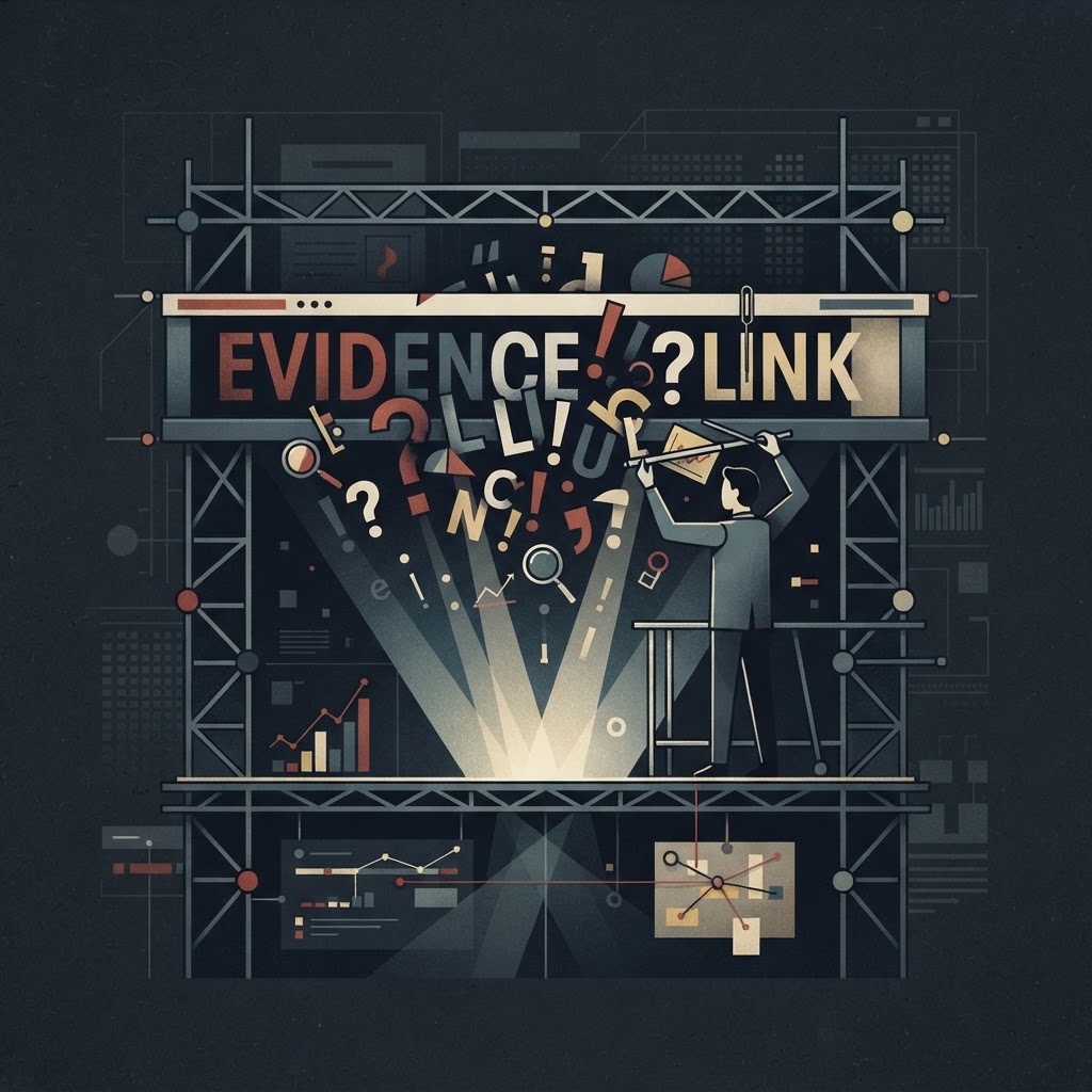
The Architecture of Attention: What the Data Reveals About How Headlines Actually Work
Behind every headline that stops your scroll lies a precise psychological and algorithmic mechanism — and the evidence for how these mechanisms operate is more rigorous, and more unsettling, than most readers suspect.
The Architecture of Attention: What the Data Reveals About How Headlines Actually Work
Before you read a single word of an article, a decision has already been made about your brain. The headline has done its job — or it hasn't. In the modern attention economy, that judgment is rendered in milliseconds, and the mechanics behind it are no longer guesswork. They are measurable, testable, and increasingly optimized to a degree that should give any critical reader pause.
The evidence is stark: on average, 8 out of 10 people will read a headline, but only 2 out of 10 will click through to read the content beneath it. This 80/20 disparity, well-documented across digital publishing analytics, means that for the vast majority of readers, the headline is the entire information exchange. The implications for journalism, public discourse, and the construction of shared reality are considerable. If most people only consume the headline, then the headline is not a door to information — it is the information.
Understanding how that door is built, and what psychological levers it pulls, is not an exercise in cynicism. It is a forensic necessity.
The Neurological Mechanism: Loewenstein's Curiosity Gap
The theoretical foundation of modern headline construction traces back to the work of behavioral economist George Loewenstein of Carnegie Mellon University. His 'Information Gap Theory of Curiosity' proposed that curiosity is not a positive drive toward pleasure, but rather an aversive response to a perceived gap between what we know and what we want to know. The brain experiences this gap as a form of cognitive deprivation — an itch it must scratch.
This framework transformed how digital publishers thought about the first sentence a reader sees. The goal shifted from summarizing content to strategically withholding just enough of it. The click became the biological resolution mechanism.
The data from Upworthy's early growth period offers perhaps the most dramatic empirical evidence for this theory. By engineering headlines that widened the curiosity gap — promising revelation without delivering it prematurely — Upworthy documented click-through rate increases of over 900% compared to baseline informational headlines. A story that might attract 10,000 readers with a straightforward title could attract 100,000 or more with a carefully constructed gap. The editorial methodology behind this was rigorous: Upworthy required every writer to draft a minimum of 25 different headlines for each story before publication. The explicit purpose was to exhaust 'safe' options and excavate the specific psychological hook buried beneath the obvious.
This is not a creative writing exercise. It is behavioral A/B testing conducted before the article ever goes live.
The Statistical Evidence: Numbers, Negativity, and Length
Beyond the curiosity gap, the data reveals several other structural variables that reliably influence headline performance.
The Odd Number Phenomenon
Analysis by Conductor found that headlines containing numerical figures are 36% more likely to generate clicks than those without. But the specificity goes further: odd numbers outperform even numbers by approximately 20% in click-through rate. The proposed mechanism is perceived authenticity — a list of '7 findings' reads as organically derived, while a list of '10 findings' reads as editorially rounded, triggering mild skepticism in the reader. The number 7, in particular, has become so dominant in listicle publishing that its psychological potency has been studied independently across cultures.
The Negativity Bias Premium
A large-scale analysis by Outbrain, examining millions of sponsored content headlines, found that headlines featuring negative superlatives — words like 'worst,' 'never,' 'stop,' or 'danger' — performed 30% better than those with positive superlatives, with a 63% higher click-through rate. This is a direct expression of what psychologists call negativity bias: the evolutionary tendency to weight threats and losses more heavily than equivalent gains. The brain's threat-detection systems are not calibrated for the information environment; they respond to a headline warning about danger with the same urgency they would allocate to an actual threat.
Publishers have known this for decades. The tabloid industry was built on it. What changed in the digital era is that the effect is now quantified, trackable, and deliberately engineered at scale.
The Length Paradox
Conventional wisdom long held that shorter headlines perform better — a legacy of print constraints and early SEO guidance. The evidence now complicates that picture significantly. Backlinko's analysis of 912 million blog posts found that long headlines, specifically those running 14 to 17 words, outperform short headlines in social sharing by 76.7%. The proposed explanation is that longer headlines provide enough contextual information for readers to feel confident sharing the content with their networks. A shorter headline may generate curiosity; a longer, more specific one generates social permission — the sense that sharing it will reflect well on the sharer's identity.
The Algorithmic Layer: Serving Two Masters
Modern headline writers do not work for readers alone. They work for machine crawlers — the indexing algorithms of search engines and social platforms that determine content distribution before any human eye encounters a headline. This dual obligation has created a standardized grammar of headline construction: listicles, 'how-to' structures, and question-based formats have proliferated not because editors prefer them, but because they signal relevance to algorithmic systems while also satisfying reader expectations of clearly defined value.
The New York Times' approach to this challenge is instructive. Using a proprietary internal tool, the Times conducts real-time A/B testing on headlines, serving different versions to different reader segments and measuring engagement within narrow time windows. In documented cases, a narrative-driven headline produced an 80% increase in traffic over a factually equivalent but more straightforward version. The same story, the same content, the same byline — two completely different audience outcomes determined entirely by word choice.
This is not anecdotal. It is industrial-scale psychological experimentation conducted on a reading public that, for the most part, has no awareness it is occurring.
The Identity Mechanism and BuzzFeed's Contribution
Beyond curiosity and negativity, a third psychological lever operates in high-performing headlines: self-concept activation. BuzzFeed's editorial team recognized early that readers engage most intensely with content that appears to be about them. Headlines framed around identity — 'Only People Who Grew Up in the 90s Will Understand This,' or 'What Your Coffee Order Says About Your Personality' — achieve exceptional social sharing density because the act of clicking and sharing is itself a self-expressive behavior. The reader is not just consuming content; they are signaling group membership.
BuzzFeed's social sharing metrics during its peak traffic years represented some of the highest identity-engagement ratios in digital publishing history. The model has since been widely replicated, but the underlying mechanism remains the same: the headline functions as a mirror, and the reader clicks to see their reflection.
The Scannability Problem: Six Words That Matter
Eye-tracking research by the Nielsen Norman Group adds a further constraint to this picture. When users scan headlines — and scanning, not reading, is the default mode of digital content consumption — they typically absorb only the first three and last three words of any given headline. Everything in between is processed peripherally, if at all.
This creates what headline analysts call the 'anchor word' problem. The structural weight of a headline must be front-loaded and back-loaded simultaneously, with the critical semantic payload distributed across those six positions. A 15-word headline may be optimal for social sharing according to Backlinko's data, but its effectiveness depends entirely on what occupies positions one through three and thirteen through fifteen.
The middle of the headline, in this model, is connective tissue — functional, but not where decisions are made.
What This Means for the Reader
The construction of a modern headline is not an act of summarization. It is the product of overlapping psychological models, statistical benchmarks, algorithmic requirements, and real-time performance data. The curiosity gap, negativity bias, numerical specificity, identity activation, and eye-tracking constraints are not independent variables — they are layered, and skilled headline writers operate across all of them simultaneously.
For readers, the forensic takeaway is this: the moment you encounter a headline, you are already inside an engineered environment. The discomfort you feel when a headline withholds information is not accidental. The urgency triggered by a negative superlative is not incidental. The familiarity you feel when a headline seems to speak directly to your identity is not coincidence.
Recognizing the architecture does not make you immune to it. The data suggests that even informed readers respond to these mechanisms. But it does change the nature of your engagement — from passive subject to active analyst.
In the attention economy, that distinction may be the most valuable click you never have to make.
Comments (0)
No comments yet. Be the first to share your thoughts.
Follow Us
© 2025 The Evidence Log. All rights reserved.
Sponsored by www.MilitaryDiscount.net
Website Designed By CharmCityInteractive.com